Challenge
The existing identity no longer reflected the energy or target audience of the festival. The goal was to reposition the event with a more youthful, approachable visual direction that could better engage a broader community.
Solution
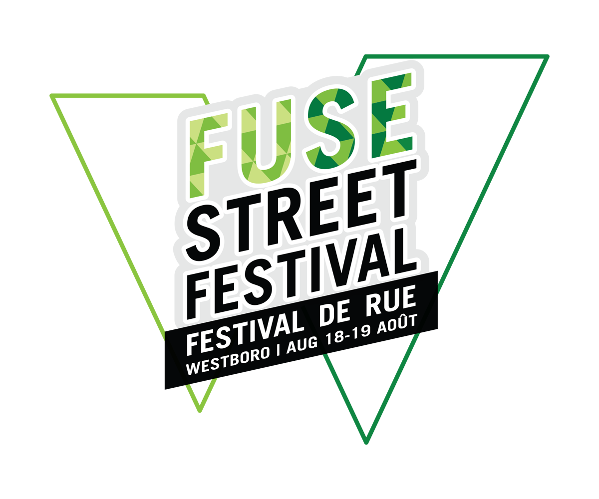
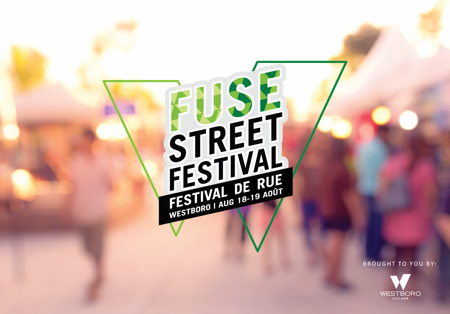
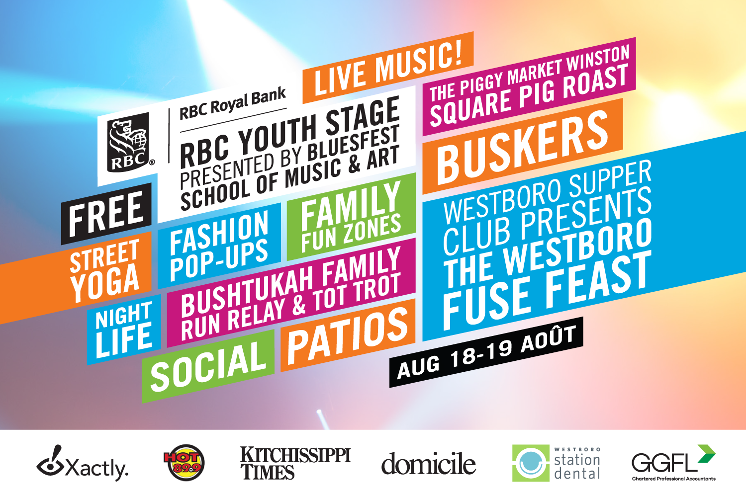
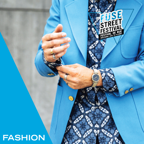
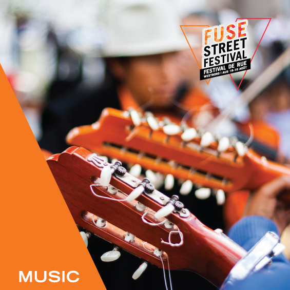
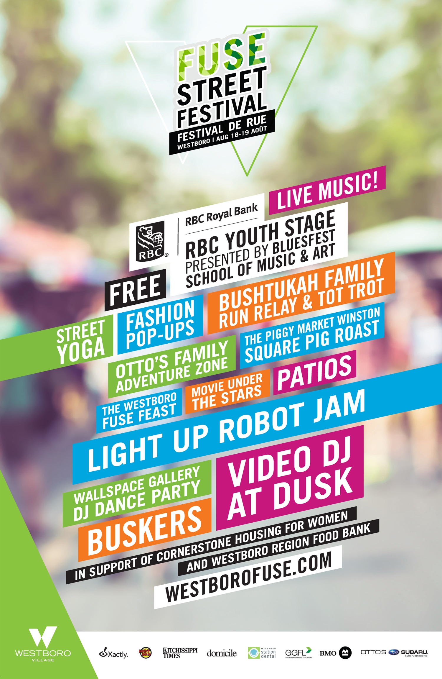
I developed a refreshed logo and visual direction that leaned into a more playful, accessible feel, using a stronger visual contrast to improve recognition and versatility. This was implemented on posters, postcards, social media, and advertising to ensure consistency and adaptability across both print and digital formats.
Impact
The updated identity created a more cohesive and uplifting presence for the festival, strengthening its appeal and improving visibility across promotional platforms.
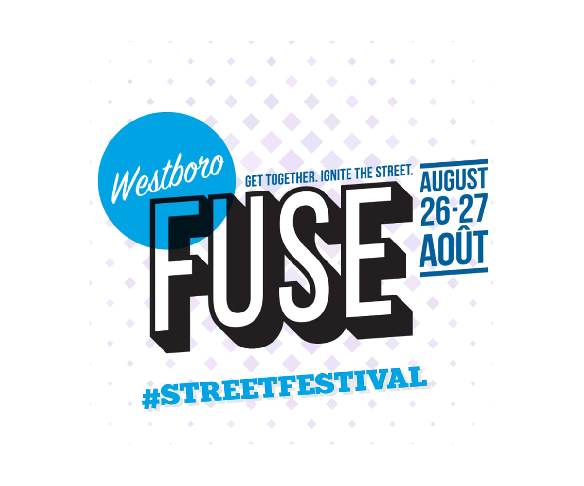
Logo (old)
Logo (new)
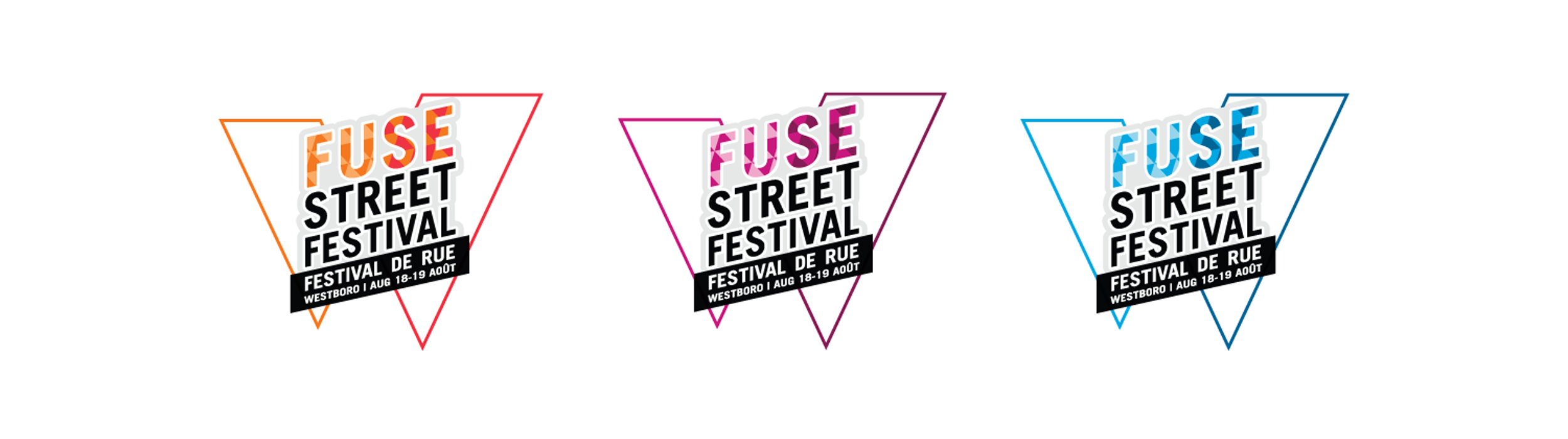
Logo (colour variations)

Promotional Header
Promotional Postcard
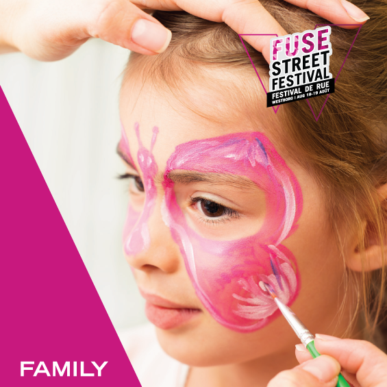
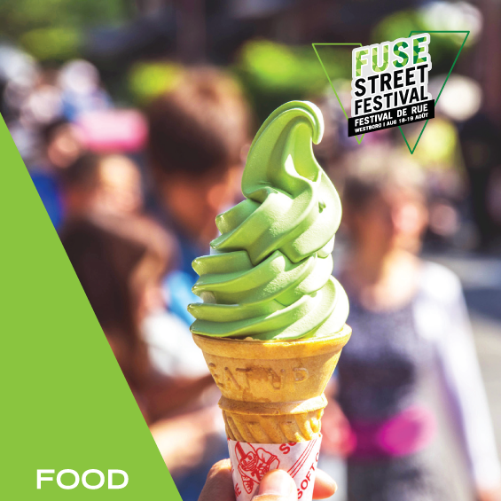
Social Media Posts
Promotional Poster
Newspaper Article
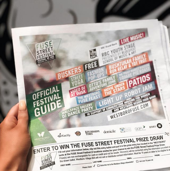
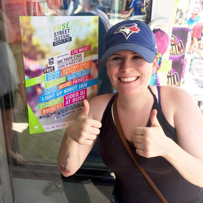
Printed Poster (+ me!)